I’m revising this blog post for early 2023… because something exciting is happening on Pinterest!
At long last, we are seeing standard pins make a comeback. 🤩 They are being shown to pinners again in their feeds and searches – and getting much higher impressions.
I’m going ahead and coining the phrase, “Pinterest 3.0.” (If you know, you know. If you don’t keep reading…)
Yep, like when Rob Lowe was tapped for The West Wing in 1999, Pinterest standard pins are BACK, baby!
Of course, getting more impressions is GREAT – but it’s just the first step to monetization of standard Pinterest pins with links. We also need the clicks and the conversions.
So in this post, I’m going to review 7 tips (best practices really) for creating standard pins that get those clicks and convert pinners to website visitors.
Because we’re due for a refresher.
And because standard pins are BACK! (Have a I mentioned that?? LOL… I’m excited.)
A Quick History of Standard Pinterest Pins: The Demise & The Comeback!
Quick history lesson: (about Pinterest pins, not Rob Lowe)
Pinterest 1.0:
Prior to 2020, most Pinterest marketers and creators focused on creating standard pins (also called “static pins” sometimes.) These are single images, usually a jpeg or png file. They link to outside content (for example, a blog post or a landing page for a free resource – though there are lots of options for where you can link them).
Pinterest 2.0:
Then in 2020, Pinterest introduced Story Pins, which became Idea Pins shortly after. Idea Pins don’t have links, but they are very powerful, because they drive engagement and audience growth on the platform.
But when Pinterest began encouraging creators and marketers to create Idea Pins, they also made changes to how standard pins were being distributed. Most creators started seeing new standard pins getting *very little* distribution. (We can see this reflected in low impressions numbers for standard pins.)
Flash forward to November of 2022, though, and standard pins are starting to be seen again – a LOT!
We started noticing this in early November, when Pinterest announced some shifts in the algorithm.
And then, in mid-November, Pinterest provided this insight into why were seeing more reach for standard pins again. They told us:
“We’ve recently made some changes to better serve the most relevant content to Pinners based on user feedback. While we continue to get positive feedback on Idea Pins, we also recognize that Pinners are looking for a variety of ways to find and consume inspiring content.
As such, we made updates to how we recommend Pins to ensure users see content that they may find most engaging and useful…
Mix your content. Now, we want to open up the lens of creation and invite you to consider Idea Pins as part of your broader content mix on Pinterest, inclusive of standard image Pins.
We believe that this shift will in the longer term help you grow your unique audience on Pinterest and result in a more inspiring, positive platform for all.
As Pinterest evolves our ecosystem to better serve Pinners, we continue to invest in expanding our monetization opportunities to more markets globally. Some of our programs, like our Creator Rewards program, are currently in testing to selected early access users in the US. In the meantime, creators can continue to use standard Pins to drive traffic to their site or places where they monetize off platform.”
Wow, right? 😲
Welcome to Pinterest 3.0.
A few takeaways / what I think Pinterest is telling us in the statement above. (This is my personal interpretation.):
| What Pinterest said, word for word: | What I think it means: |
| “Pinners are looking for a variety of ways to consume content.” | Pinners like to see standard pins, too. Not just Idea pins. |
| “Mix your content… Consider Idea Pins as part of your broader content mix on Pinterest, inclusive of standard image Pins.” | Make standard pins, too. |
| “Creators can continue to use standard Pins to drive traffic to their site or places where they monetize off platform.” | We understand creators need to monetize, and that not all creators can do that through Idea Pins. So, it’s cool again to use standard pins to drive traffic to your websites and offers. |
Now… If you thought this day would never come, I’ll try not to say “I told you so.” 🤣 (Oh shoot. I just said it.)
(Indeed, I’ve continued to recommend – all along! – that Creators invest some time into creating standard pins – because I always believed the pendulum would eventually swing back.)
Okay, now moving on to…
What are the best practices for Pinterest Pins (Standard pins) that get the clicks & convert?
So… this shift presents the need for us to re-visit the best practices for creating Standard (LINKED!) Pinterest pins.
Let’s do that.
Quick note first: While everyone’s Pinterest account and audience is different, and different things work for different accounts and niches / verticals…
The following best practices and tips are based on the commonalities that I’ve seen in DOZENS of successful Pinterest profiles.
It’s been my honor to create and/or help manage more than 30 accounts for coaches, experts, course creators, and service providers! And, I’m sharing what I’ve learned here.
So for some of the tips below, I’m including example of standard pins I’ve designed over the years for clients. This way, you get to see best practices in action – and I get to scroll down memory lane! 🙂
Ready? Okay!
Let’s take a look at seven ways to design standard Pinterest pin graphics that convert…
(Scroll below the “cheat sheet” for the details and examples…)
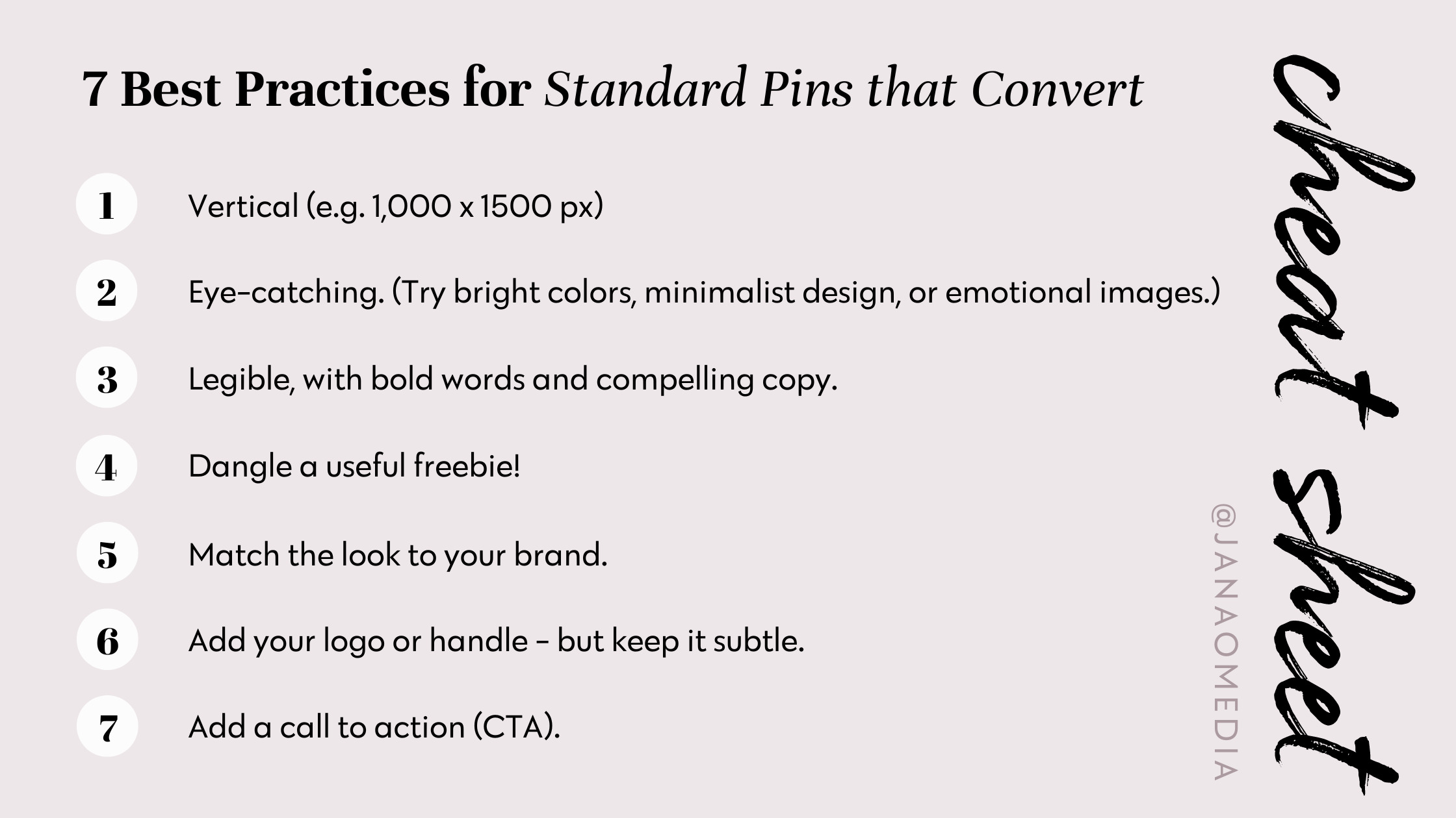
1) Make them vertical – properly sized for Pinterest.
Pinterest suggests 1000 x 1500 pixels in its documentation. However, the important thing is that your pins have a 2:3 ratio (width to length).
Pinterest’s UI (user interface) on both desktop and mobile is optimized for these vertical images, and so pinners have the best user experience with them. As a result, we (the creators community on Pinterest) do believe that the algorithm will prioritize vertical images – and show them to more people! (We like more people! 😉
2) Make them eye catching – to stop the scroll.
Think about the way you use Pinterest as a user… (or a different visibility platform.) As you’re scrolling, something catches your eye… So you stop scrolling to eyeball it – and find out what it’s about. That is the first step in engaging the pinner.
To grab her attention, consider using bright colors, minimalist design, and / or images that evoke emotions.
(You can also head to this blog post for 3 more tips about Pinterest pin copy that stops the scroll of your idea audience.)
Example 1 – Bright colors:
Example 2 – Minimalist Design:
Example 3 – Emotional Images:
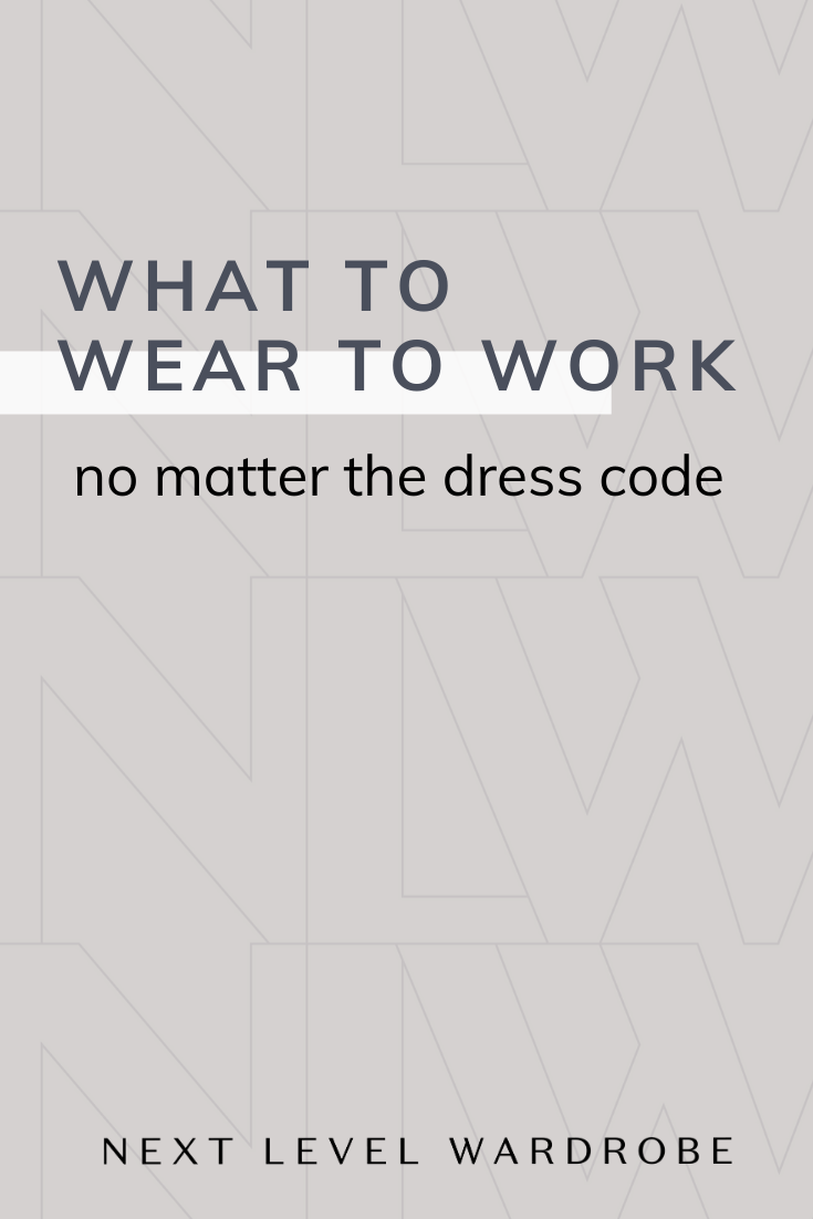

3) Be sure they’re legible, with bold words and compelling copy.
Once you’ve got her attention, your next priority is to QUICKLY convey what your pin is about.
This means your pin MUST be legible. (Obvi, right? But I can’t tell you how many pins I see that aren’t easy to read! Ack!) Here are some ways you can be SURE yours is.
- The main parts of your message should be in large font – and bold enough to read.
- Be sure there’s enough contrast behind any text – so it’s *super* easy to read.
- Use fewer words overall. Fewer words = faster to read and understand.
- Consider NOT choosing script fonts – which can be hard to read. But if you use them, use them very sparingly.
Best practices in copywriting come in to play, too. What does your ideal customer need to see – to know that this content is RELEVANT FOR HER? That there’s something here that will solve a problem she has – or enrich her life or business in some way?
Example 4 – Overlay between
text and photo (in opaque white):
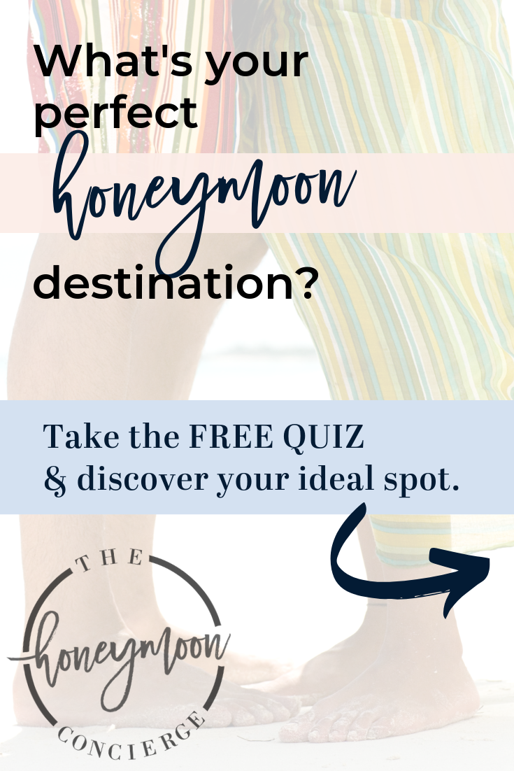
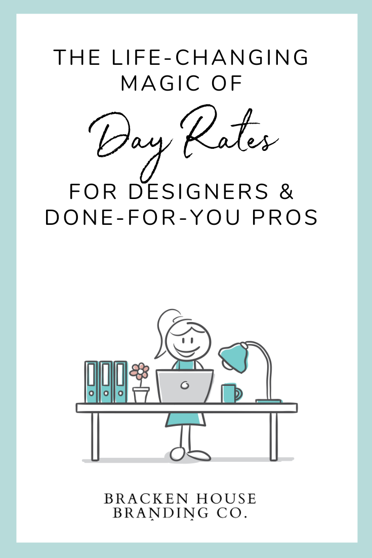
Example 5 – Use script fonts
sparingly.
Example 6 – Show her she’s in
the right place.

4) Promise an “I have to have that!” freebie.
One of the best ways to convert a pinner to a website visitor – is to dangle something free – and irresistible. In marketing speak, we call this a lead magnet 😉 because it draws ideal audiences in to your content and email list.
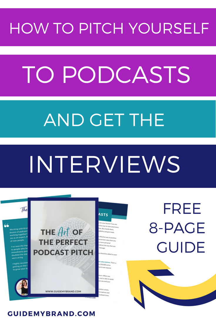
If you can offer a visual preview of the freebie she’ll get when she clicks through, do it! This way, when your dream customer follows your pin, she is already primed and expecting to opt-in to your list to get that thing she has to have now.
Lead magnets can be simple PDF checklists or worksheets… video trainings or webinars… quizzes… there are many possibilities here. (Pssst… I think this episode of Amy Porterfield’s podcast does an amazing job describing HOW you should plan and design your lead magnet for list building…)
Here are a few pins I’ve designed… to give you inspiration for pin designs that showcase lead magnets / freebie opt-ins. (Examples 7 through 9!)
Examples 7, 8, and 9 dangle lead magnets:


5) Match the pins’ “look” to your brand.
Most people who find your pins on Pinterest (in their searches and smart feeds) are new to you. But, it’s still important that your pins have a consistent style that matches your brand.
This way, over time, as people encounter your pins, they will start to recognize them and associate them with you and your brand. This is about the extent of “like, know, trust” on Pinterest (because it’s not a place where you need to engage – which makes it low maintenance! #yay!) – but this consistency of branding has been shown to increase click-through rates.
Even though pin graphics should be consistent (branding-wise) they should still vary a bit for fun… and so your pins don’t appear too repetitive – or even spammy – to pinners.
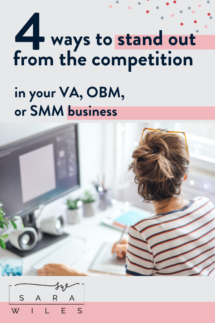
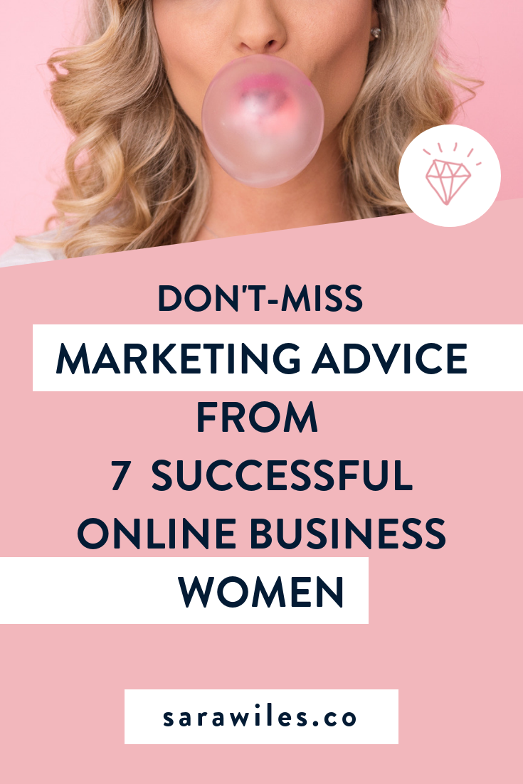
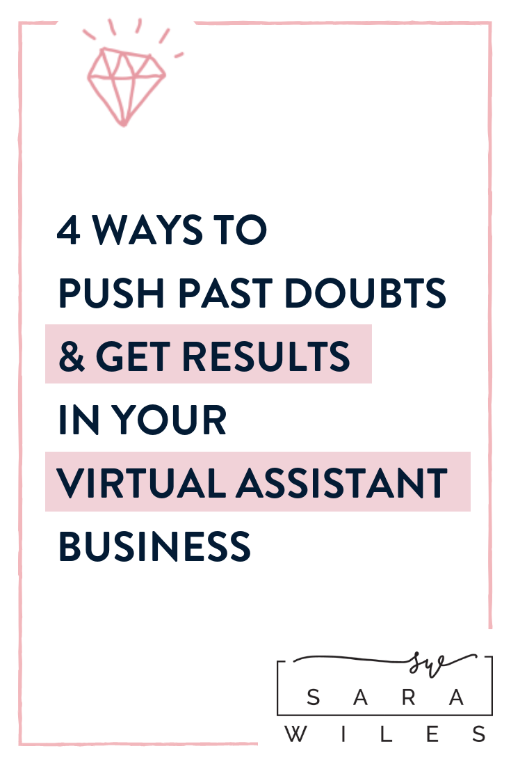
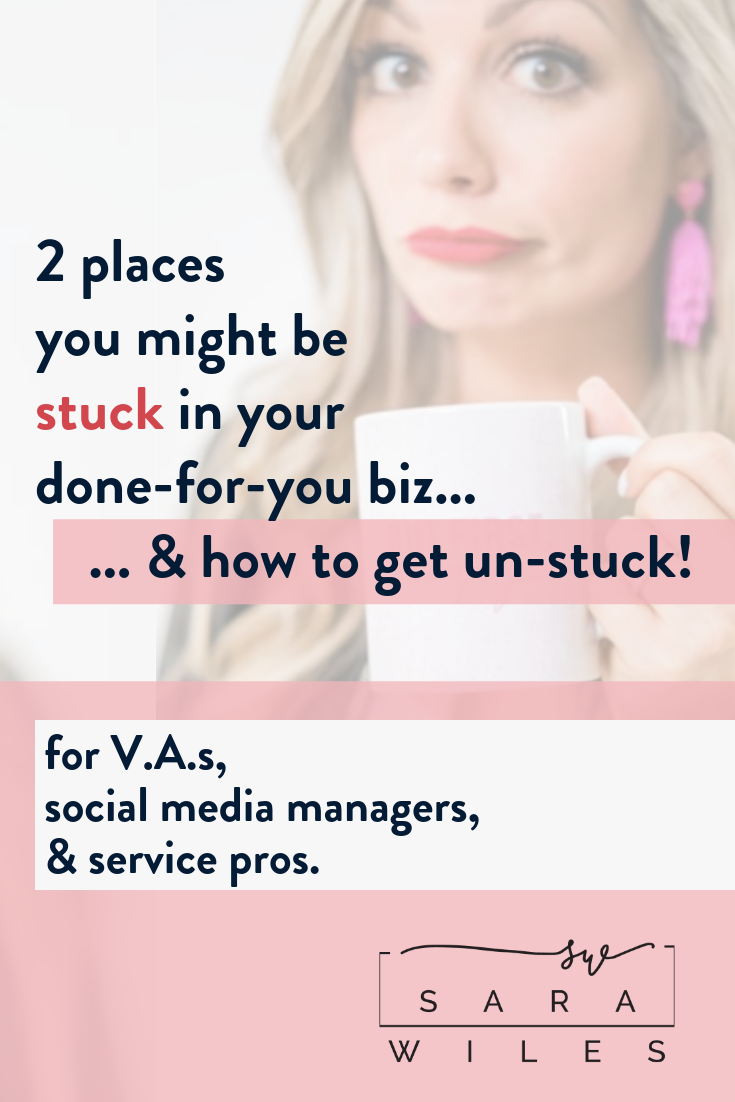
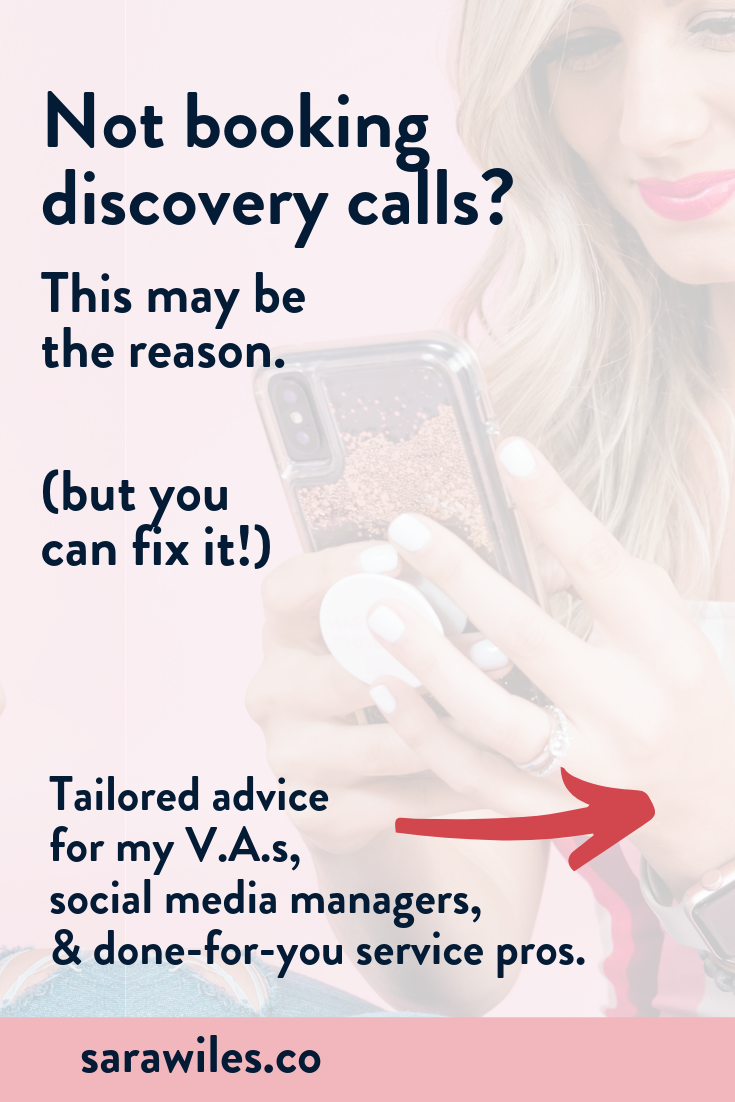
Here are a four pins (Examples 10 – 13) I designed for one client (Sara Wiles!). As you can see, they all match her brand… but are all a bit different, too.
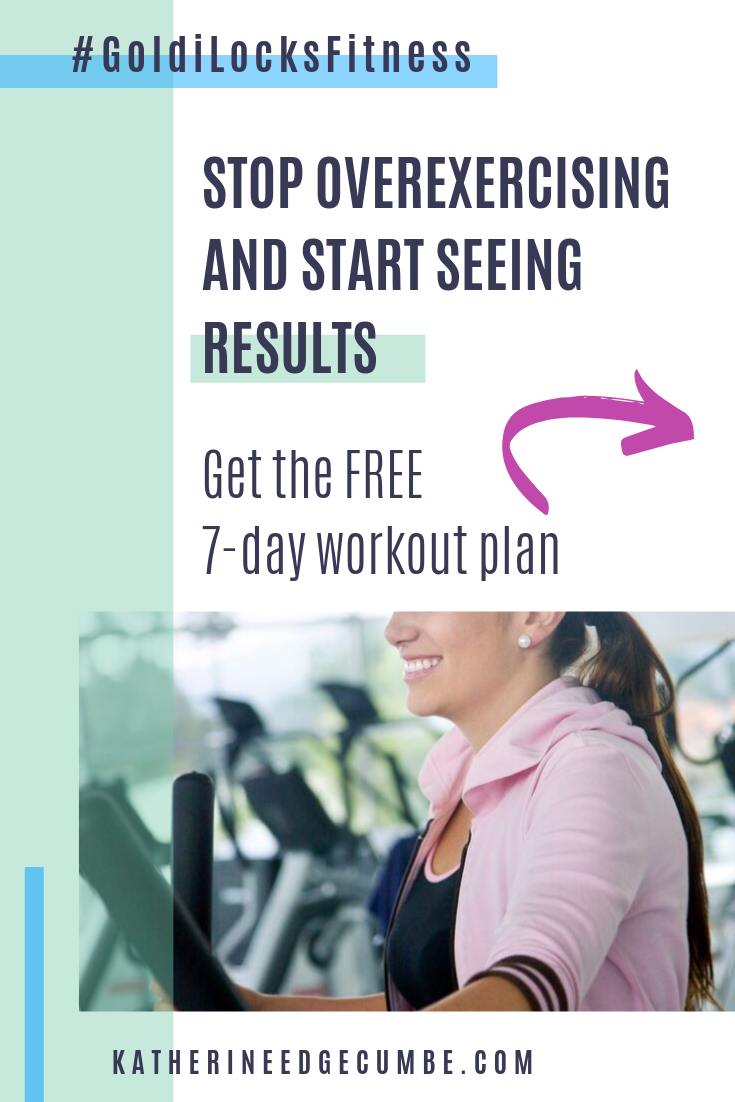
6) Subtly brand them – with your website or simple logo.
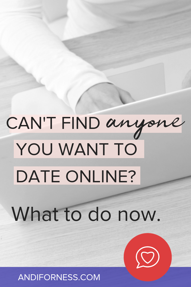
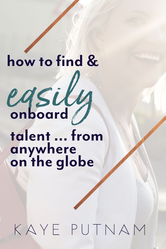
Speaking of branding, if you’re going to invest time or money into creating some viral-worthy pins, be sure to add your simple logo, business name, or simply your handle or website url.
This helps with that brand recognition – but more importantly, it may help increase your clicks, too. A study done with promoted pins showed that the “credibility” that subtle branding lends increased click rates. (It follows that this would be true for pins with organic reach, too!)
(Hint: Don’t use big, colorful logos. They pull focus from your message and may have the opposite effect.)
Here are a few client pins (Examples 14 – 16) that demonstrate different ways to add subtle branding (look to the bottom of the pins!)
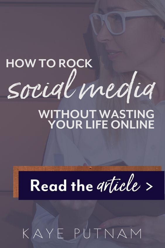
7) Add a call to action (CTA).
Always tell the pinner what to do next – with an explicit or an implied call to action.
This is a best practice in all areas of marketing, and Pinterest is no different. A clear call to action will always increase your chances of converting your prospect to take the next step with you.
Get some Pinterest Call to Action examples and options here.
Examples 17, 18, and 19 have clear Calls to Action:

So, there you have them, Folks! 😉 My best tips to ensure that – when your pins get discovered – they will do their job and convert.
Ready to use Pinterest to get clients for your business?
Are you an online coach or service provider? And you want to learn how to set up a Pinterest account that will grow your audience and attract clients — on autopilot?
If so, then my course Pinterest with a Purpose was created for you!
It’s a self-study e-course that walks you through *every step* of setting up your strategy and your account. It reveals the methods I perfected over YEARS doing strategic Pinterest set-ups for clients!

